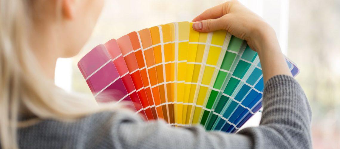
White is one of the most common colors for a wall or furniture, almost self-evident for most.
Each of our suggestions is based on a different logic and one by one, they all come out great.
We will explain what makes them so unique, to know and…copy!
In a luxurious and sunny bathroom, the use of white equals light, purity and design uniformity. In this particular case, every large surface is white, with details of gold and natural wood framing the project.
The great gift to you and to us is that each team of designers had a very complete picture of what they had to do and why.
So we have a complete analysis of how the designers moved and how they arrived at the decorative success we see.
We leave you with suggestions for your home with an emphasis on the white color of walls and furniture!
The white walls of a sunny kitchen maintain a simple, clean and relaxed style.
The white background is what can be used in this art and accessories, along with vintage and modern items.
The blue – almost the shade of ink – color of the island’s cabinets is rich, rich and goes well with white.
A beautiful combination of white, cream, gray and wood guarantees a timeless and interesting color palette.
In the high-ceilinged asymmetric bedroom, the attention does not fall on the ceiling for the wrong reasons, as the white camouflages the design differences.
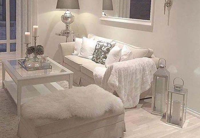
A very clever use of white on white, with an emphasis on transparencies, is the demarcation of uses with carpets and with beautiful metallic details in the rooms.
In a space with a heavy use of white, the beams and parquet provide a very beautiful contrast with dark wood.
White can be used on a large scale, to be framed by the light wood and with the many gold details to give an air of luxury.
The blue bohemian tiles in the kitchen are a tried and true choice! Staying in the luxury style, the same is true of the unique vintage bronze lamps.
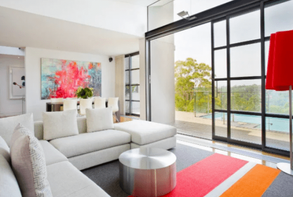
In a space with a lot of white, come the metal coffee table and the black windows, to give two metallic shades.
But all of these, as well as the gray in the carpet, are the neutral notes for the red and coral carpet and lamp that make this living room unforgettable. Very clever use of color in a room with very clever use of white!
A bedroom that draws its inspiration from Scandinavian decoration, maintains its… coolness thanks to white! Because of the use of wood and the rich textures in the fabrics though, it takes on an interesting warmth!
In a space with all the walls and counters white, the kitchen takes on a completely different style when the contrast comes through the dark wood.
White is the basis for Rustic and industrial decoration. Without the white the space was heavy and dark.
The white combined with the gray color palette guarantees a space that always looks bright. It creates a very nice contrast with the dark parquet as well.
The white and the wood on the floor and the ceiling in the wonderful view take the reins in terms of decoration. When you have such an excellent view, you don’t “burn” to design something with color that will draw attention from the strongest point of your home.
White, cream, beige and all neutral colors work with blue to create an interesting feel of seaside decor.
The wide-plank parquet works with the white on the cabinets and walls harmoniously, making it possible to use a fair amount of gray marble on the counters and lighting in a modern industrial kitchen environment. Simple logic, perfectly executed.
The design of the living room can be kept simple and elegant, with very nice details. Just like true luxury: no frills. Great furniture, sparsely placed, with an eclectic or minimalist aesthetic. This is an enviable room full of art and personality. What every home wants. Character!
We hope we gave you a different use of white, with another logic or another justification.