Change Decoration…Change Mood
When you slowly see August come to an end he has to make the decision, summer ends and autumn comes to the fore.
It’s natural to feel melancholy, but there is a secret that will radically change your mood and make you see autumn with a different eye. This is nothing but the decoration of your home. Some changes in your decoration will refresh your space and put you in the right mood to welcome the new season.
The Colors that will prevail: After a full summer with a lot of sun, we can’t help but welcome autumn with warm shades mainly in the living room, the living room but also in the other areas of the house.
Their honor is beige, brown, orange, petrol, green and other warm colors.

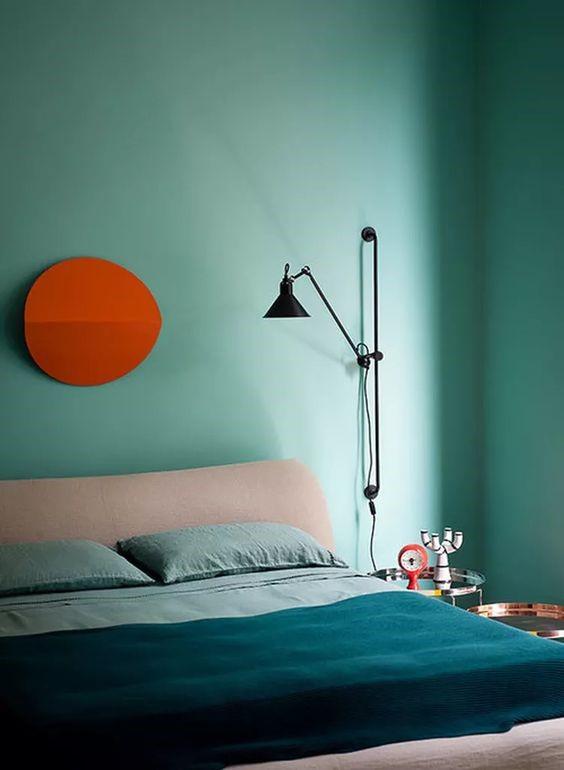
Orange: The ease with which Orange is combined with white – beige, as well as with all shades of natural wood and matting, makes it one of the most practical options even for subsequent decorative changes, since you can easily add orange elements to an already designed living room dominated by white, black, beige, brown and generally earthy tones.
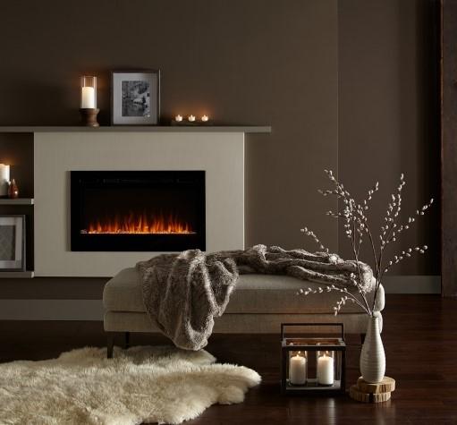
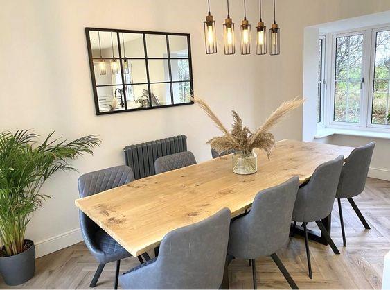
Coffee: This year, more than ever, decoration is inspired by nature. The natural element in our personal space makes our space seem more warm and inviting. The earthy tones of Coffee are often associated with autumn, as they evoke elements of this season. Draw inspiration from the fallen leaves of the trees, the soil wet from the rain, the hot chocolate. So, make your fireplace the protagonist of the house by accentuating the wall above.
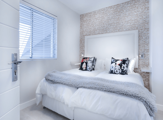
Beige: The ultimate color for balance & relaxation!
If you want to be like this in decorating and your home is tasteful and beautifully decorated, then the right color choice is of utmost importance. One of the most popular shades that you can put on your walls, if with the style of decoration you will choose, is beige!
Beige is a natural shade, which will become the perfect base to create a relaxing and cozy atmosphere in your home.
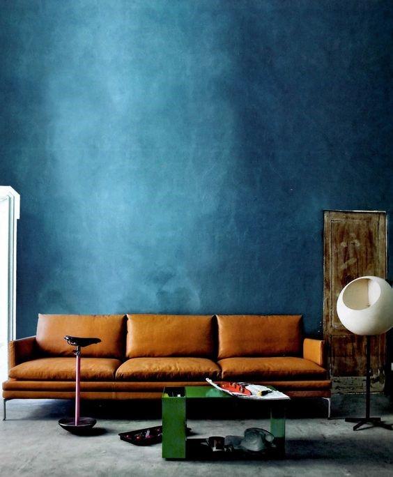
Petrol: When you like to change the decoration of your space at regular intervals, you are likely to try many different styles over time.
Why change the decoration of your space?
Maybe to refresh yourself and improve your mood.
On the other hand, maybe you do it because you like to follow fashion trends.
For whatever reason you wish to remodel your home, the point is that at some point you may tire of traditional and trivial patterns.
For example, you can get tired of the existing colors and want to see something different. A color suitable for experimentation is petrol.
However, it’s not an ordinary shade, so you might be wondering: What does petrol paint go with?
It is not unreasonable to wonder about the petrol color with what it matches in the decoration of the house.
It is a very special color between green and blue, which needs attention in its use.
What do we mean by this?
But of course, as petrol is a dark color and dark colors can reduce the brightness of the space, on large surfaces.
For this reason, you need to know with which colors petrol is combined, but also on which surfaces and objects it is best suited.
The Petrol wall color is combined with dark shades but at the same time intense. This is how the favorite vintage style is simply created.
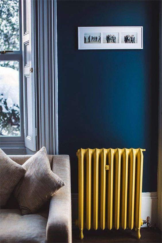
Petrol & White: There is no brighter and brighter color than white. White is the preeminent color that matches all other colors without creating visual noise. It is suitable for highlighting small spaces and making them appear larger.
Petrol & Beige: Beige is one of the most favorite colors for decorating and painting walls. It can work independently, as a basic color, but also supportively, as a secondary color.
Petrol & Coffee: If you like the wooden furniture in your home and don’t want to cover it, that’s not a problem.
Brown is another correct answer, if I wonder about oil paint what it goes with.
Of course, brown is a dark color, as is petrol. However, oil is also a shade between blue and green. For this reason, it can easily be combined with earthy colors, without worrying that the result looks too loaded.
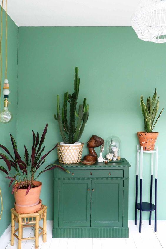
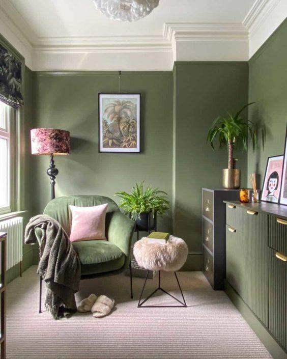
Green: It is no coincidence that the color green is an extremely therapeutic agent for our psychology.
It is the color that reassures us on a very primitive level. Where there is green, there is life.
Green is in the middle of the color spectrum, so our eyes don’t need special adaptation to detect it.
Therefore we are talking about a relaxing – in all respects – color that brings balance and harmony.
The shades of green: The truth is that we can find many shades, unlike other colors.
Emerald, forest green, green, khaki, unripe olive, moss green, teal… How many shades can we find!
The psychological effect one experiences varies depending on the tone.
Light green is tonic and refreshing while on the other hand olive seems a bit heavy and lifeless.
Green in our life: Without a doubt green in a space creates the feeling of peace and tranquility. It is no coincidence that Medicine has the color green for its “pantiera”. Even in businesses around the world, green logos on brands have a large percentage of choice.
When we choose the color green to “dress up” our home, we have the need – consciously or subconsciously, as Freud says – to feel calm and warm. We seek our inner harmony, our contact with mother nature and all that brings us closer to our most hidden desires.
So if you also love the color green and want to include them in your personal space, you definitely need harmony.
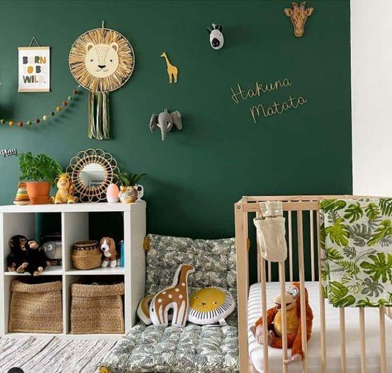
Make the children’s room a playful zoo!
Find all the shades through our palette in #toxromapouagapas.